Social Cereal

Prev: Paint-by-Numbers
Description
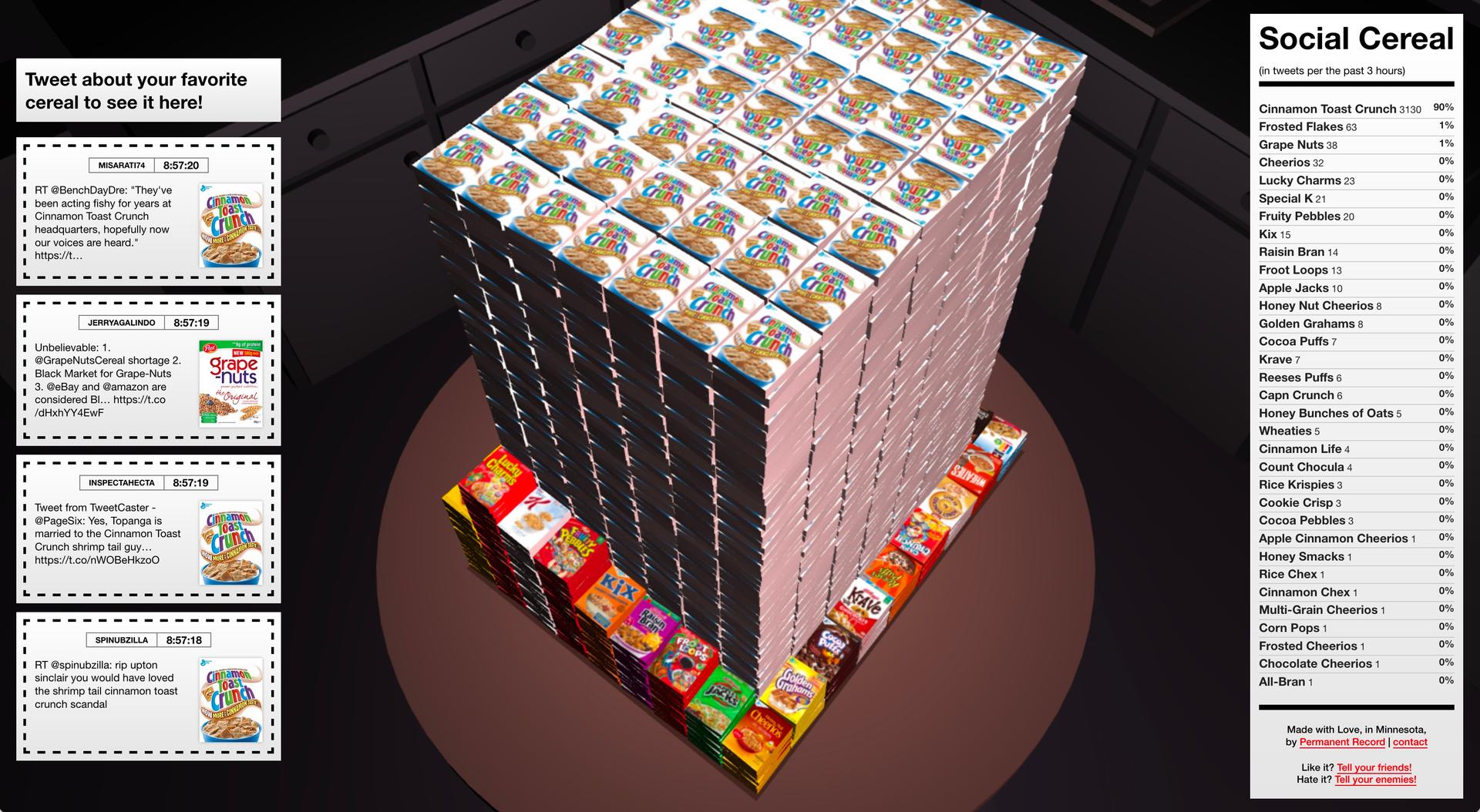
A good data visualization should be able to clearly communicate the given state of a system. This one shows how many mentions a certain cereal received on Twitter in the past 24 hours in 3D.
Next: BetamaXmas
Latest Tweets

Cereal Breakdown

Shrimpgate!
